Storeis
12TH JANUARY 2022
Checkout Form: how to optimize it and increase sales
From our ecommerce experience and a recent Baymard Institute usability study, we’ve gathered some information and best practice to improve your checkout conversion rate.
MAIN REASONS FOR CHECKOUT ABANDONMENT
Periodically we come across research and articles that relate the number of steps within the checkout with the Conversion Rate.
In fact, it is believed that the fewer steps the user takes during the checkout phase, the better (and higher) the conversion rate will be.
From our experience in the field, this correlation does not exist.
The key to minimizing checkout dropouts and improving CR is not the number of steps, but the simplicity and clarity between steps.
In fact, minimizing the cognitive effort that a user makes during the finalization of their purchase pays off in terms of purchase success.
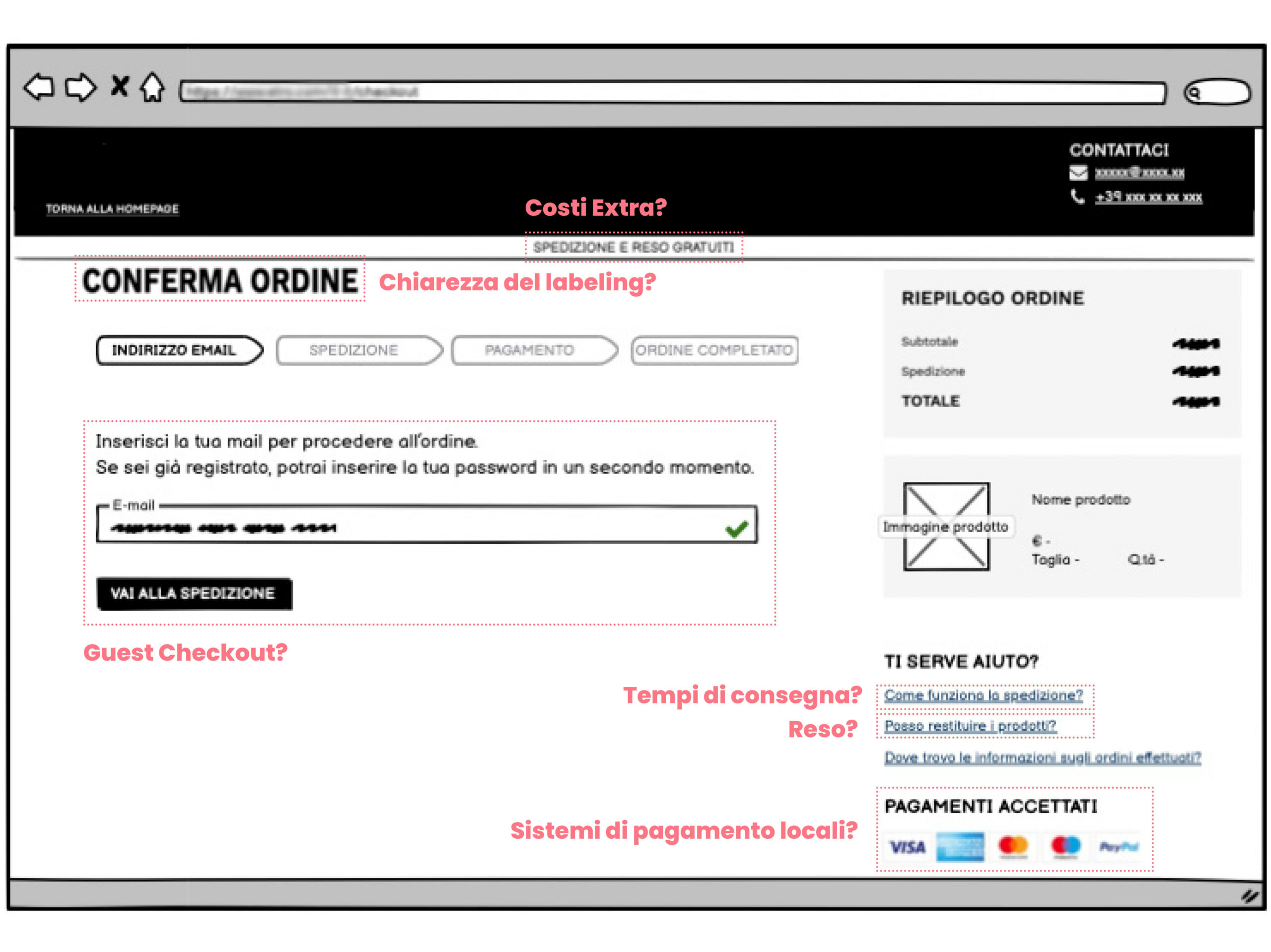
Thanks to data analysis and usability tests carried out with real users, we have collected a list of elements that we believe are crucial in the checkout phase:
- Extra costs
Additional costs (including taxes, shipping costs, …) must be declared in the initial phase - Delivery time
Delivery times must be stated clearly and should be in line with the customer’s expectations - Clear labels in fillable fields
Labels must be understandable to the users; the request for further data can be included if clearly explained and motivated (e.g. telephone / mobile number can be used by the courier while delivering the order) - Guest checkout
The possibility to purchase via guest checkout vs the requirement to create an account before proceeding with the purchase - Return policies
Return policies must be explicit and detailed - Local payment systems
Adopt the payment systems preferred by users based on the country of origin - Correct technical functioning
The correct technical functioning of the checkout is essential, but it should not be taken for granted. It is good practice to provide for a periodic analysis of the order history with respect to traffic. In this way it will be possible to understand whether there is any technical issue or the process is working correctly.
CHECKOUT OPTIMIZATION: THE RESEARCH OF THE BAYMARD INSTITUTE
In addition to our insights, we would like to share a recent research carried out by the Baymard Institute*, which identified the following causes for abandoning the checkout:
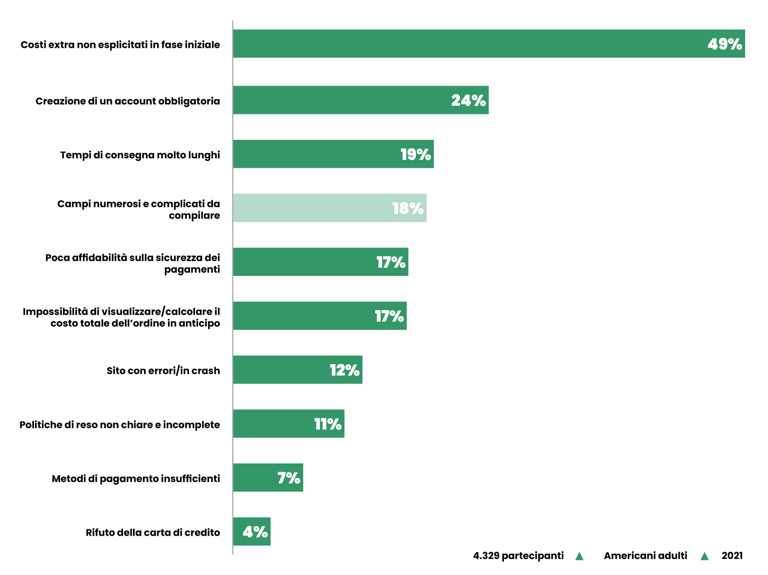
Among these it emerged that the number of fields is one of the major causes of friction, and in detail:
- the checkout process takes an average of 5.2 steps
- the number of fields in the checkout forms is very high: the average is 11.8 fields
- 18% of users abandon orders in checkout due to a “too long / complicated payment process”
Therefore, this research shows that compared to the number of steps, the number of fields within the checkout has a greater impact in discouraging the user from completing the purchase.
HOW TO REDUCE THE NUMBER OF FIELDS
So, how to decrease abandonments and have a good CR simply by optimizing the checkout form?
Definitely by reducing the fields defined as mandatory by 20%-60% and keeping only those that are truly relevant!
To better investigate this topic, we’ve gathered 5 tips and examples that can help you reduce your churn rate and improve your conversion.
-
1. Use “Single” Name Field
Users generally think of their name as a single entity, which therefore includes Name and Surname.
In user tests conducted by Baymard, 42% of users have incorrectly typed out their full name in the name field at least once; in contrast, only 4% of users hesitated briefly before typing their full name, and none experienced any typing or interacting problems observed in the case of multi-name fields.
Therefore, our first suggestion is to support user behavior and combine First and Last Name into a single “Full Name“ field.

-
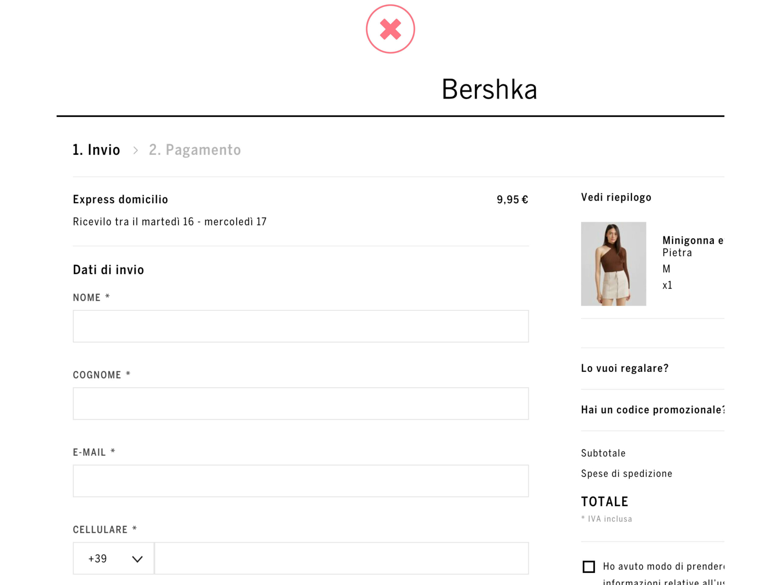
2. Hide Address Line 2, Company and Coupon Code Fields
Some fields such as Address Line 2, Company and Coupon Code are generally optional and are usually filled in by a small subgroup of users; however in most of the checkout forms, these fields are shown on the page, causing friction in the compilation. Baymard’s research confirms this trend:
- 30% of the analyzed users stopped after filling the address field in an incomplete way, wondering which data should actually be entered (only street, or even the house number, postcode, province, …)
- the Company field was not completed by almost all users who, however, when they met it, spent time reading and understanding the label
- the Coupon Code field proved to be an obstacle in completing the form; in fact, instead of moving on to the next field, many users started to think how to obtain a discount code and this led some of them to completely abandon the site during checkout to search for promo codes on Google.
In this case, our advice is to use the links or accordions; the fields will then be shown only when clicked.
As Baymard’s research clarifies, the checkout process is smoother and more focused when fields like these aren’t shown directly on the page, but are called up via links.


-
3. Use Zip/Postal Code Autodetection
Users often stumble when trying to accurately type the Country, City, and Postal Code fields; and significantly slow down checkout progression when selecting their City from a drop-down menu, particularly when attempting to complete this task on a mobile device.
To greatly reduce the complexity of this set of fields, we suggest focusing on the ZIP code field to obtain information about both the City and the Country of origin of the user. The automatic detection in fact allows the removal of the other two fields which can therefore be safely ignored.
- Of course, users should be allowed to override the input, just in case the automatic detection fails to retrieve the information related to the zip code.


-
4. Hide “Billing Address” Fields
- Baymard’s research shows that in 12% of ecommerce sites, the default rule is to use different shipping and billing addresses.
- This means that most users, who usually have a single residential address, are needlessly intimidated by the high number of form fields presented on the page.
Setting “Billing address = Shipping address” by default is a good solution to this problem, reducing the visible fields to fill in by a third.
This way, the subgroup of users who need a separate billing address will simply have to clear the checkbox and fill in the billing fields.
Clearly, an exception to this are sites where the order logs show there is a very large amount of customers who actually use two different addresses: this is often the case at gifting and business-to-business sites.


-
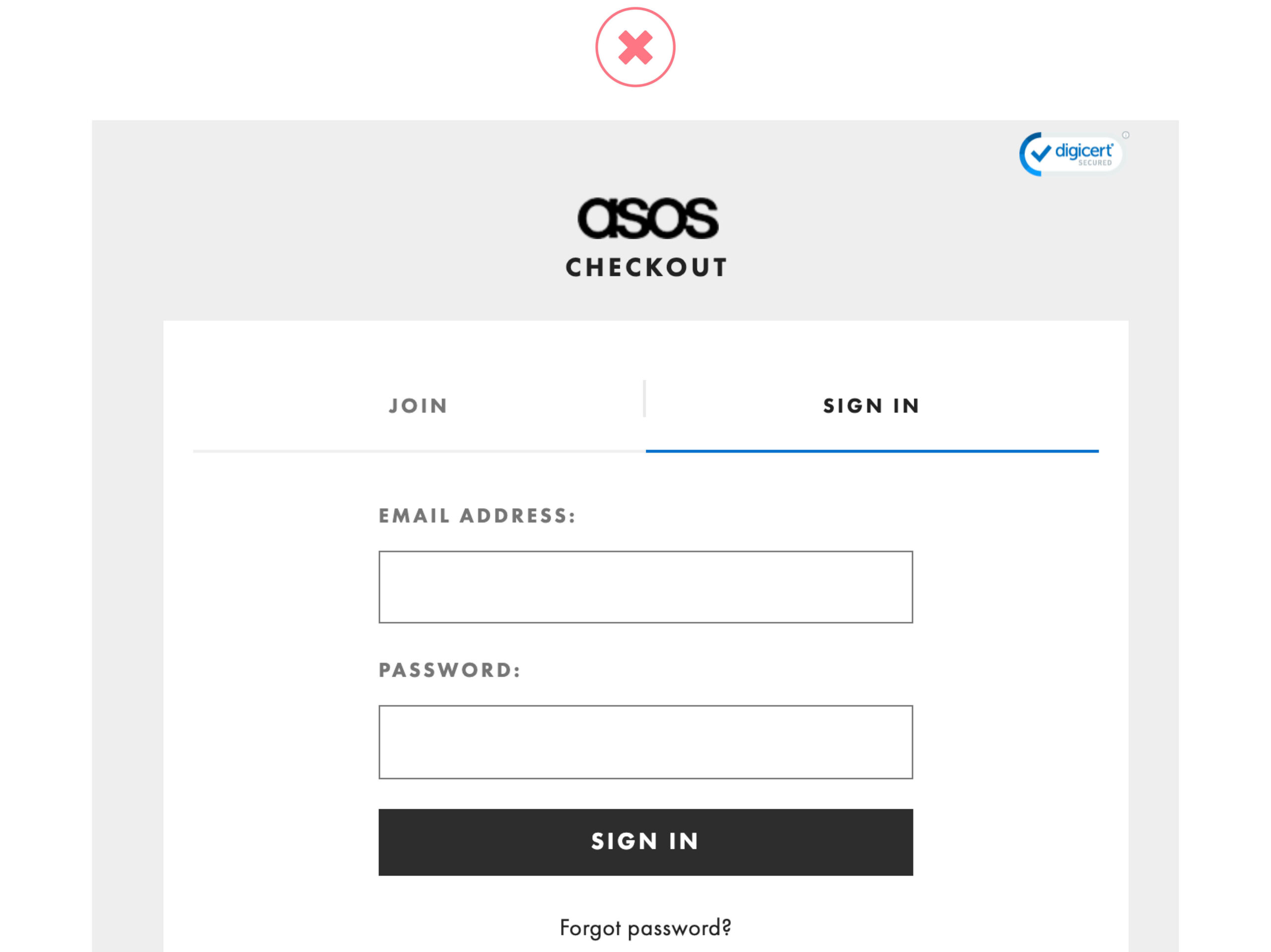
5. Postpone Account Creation
- Requiring users to create an account to check out or even prompting non-subscribers to fill in unnecessary extra fields is a major cause of friction. Typical examples are the “Create a password” “Date of birth” fields, which can cause abandonment due to the intimidating nature of the payment process.
Undoubtedly, account creation can benefit the company in terms of lead generation and the user in terms of faster checkout in the future, but at the same time it distracts from the main goal of the checkout process, which is to have users successfully place their order.
We therefore suggest postponing the creation of the account to the order confirmation phase. In fact, the user will have already entered the information necessary to create the profile during checkout, thus reducing the registration to a maximum of a couple of fields.
Se si opta per questa scelta, ci raccomandiamo di assicurarsi che gli utenti siano informati durante la fase di selezione dell’account che avranno la possibilità di creare un profilo alla fine del checkout.

HOW TO IDENTIFY THE MAIN BARRIERS OF YOUR CHECKOUT
Each checkout works differently, but one of the most popular methodologies for identifying its main barriers is the usability test.
Thanks to this activity it is possible to observe and understand how users interact with the site, highlighting blocks and braking elements encountered during navigation.
It is essential to focus on the right points during user tests, namely:
- Select the correct target to test, based on the countries that have the greatest business weight at the company level.
- Run tests quickly: A full user testing session can last less than a month. The analysis and observation of “only” 5 users allows us to identify 85% of the problems, as well as obtaining useful information on what they are looking for and how they look for it on the site.
- Educate the internal company team in the culture of testing and emphasize the importance of this methodology, focusing on the needs and requirements expressed by the user. Only in this way will the team’s activities be focused on solving the most critical problems, avoiding wasting time and resources.
*Baymard Institute, Authored by Christian Holst — “Checkout Optimization: 5 Ways to Minimize Form Fields in Checkout”, 19.10.2021.
ECOMMERCE TIPS
Black Friday: How did it go?
We analyzed what happened during Black Friday 2021 in Italy. Find out which are the most interesting categories and the most visited ecommerce!
ECOMMERCE TIPS
Checkout: UX Assessment
The purchasing process is one of the key aspects of an ecommerce. In this article you will find some of the items our SEO & UX team usually analyzes during the assessment phase.
SUBSCRIBE TO THE NEWSLETTER
WANT TO KEEP IN TOUCH?
For you, a sneak preview on:
- Researches, strategic reports and white papers
- Case Studies
- Invites to workshops, training events and webinars
- Job alerts and job openings notifications
We promise you fewer but quality emails!